Oxmantown Skincare is an organic, handcrafted skincare brand based in Stoneybatter, Dublin. In 2023 I worked on a brand refresh focused on refining the product range, reducing waste and developing a more consistent visual identity across print and digital.

Year

2022

Sector

Retail

Tools

Adobe Indesign
Adobe Photoshop
Adobe Illustrator
Squarespace

Workplace

Year

2022

Sector

Retail

Tools

Adobe Indesign
Adobe Photoshop
Adobe Illustrator
Squarespace

Workplace

Sector

Photography: Johnny Mallin
Photography: Ruth Connelly
Set and Styling: Play Nice Studio

Guzzle magazine on top of a zebra patterned tablecloth, with a bright pink background, the masthead and two plastic lizards on the front cover

Challenges

I led the refinement process, analysing the existing brand and identifying opportunities to simplify and strengthen its visual language. I worked closely with the client and external producers across packaging, print, and photography, ensuring the new direction translated coherently across each touchpoint.
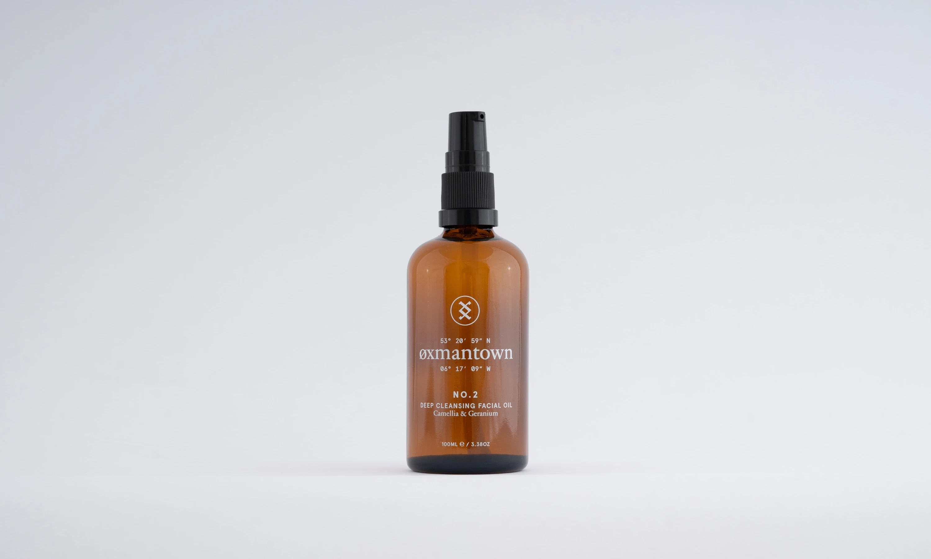
Detailed shot of one bottle with the branding screenprinted on the front, and dropper top
two jars and a small glass bottle with a dropper top, in a plain white background
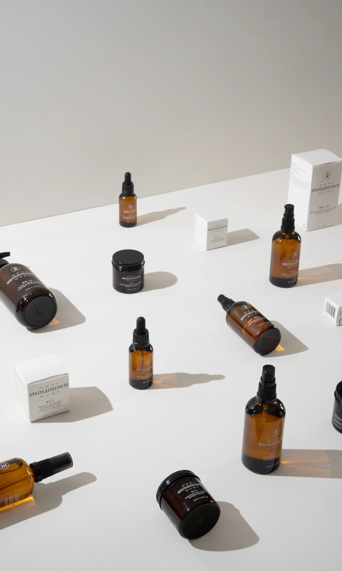
a collection of bottles and jars with the oxmantown branding on them, in a plain white set, with some placed on top of plain white geometric shapes like rectangles, quarter circle wedges and a sphere
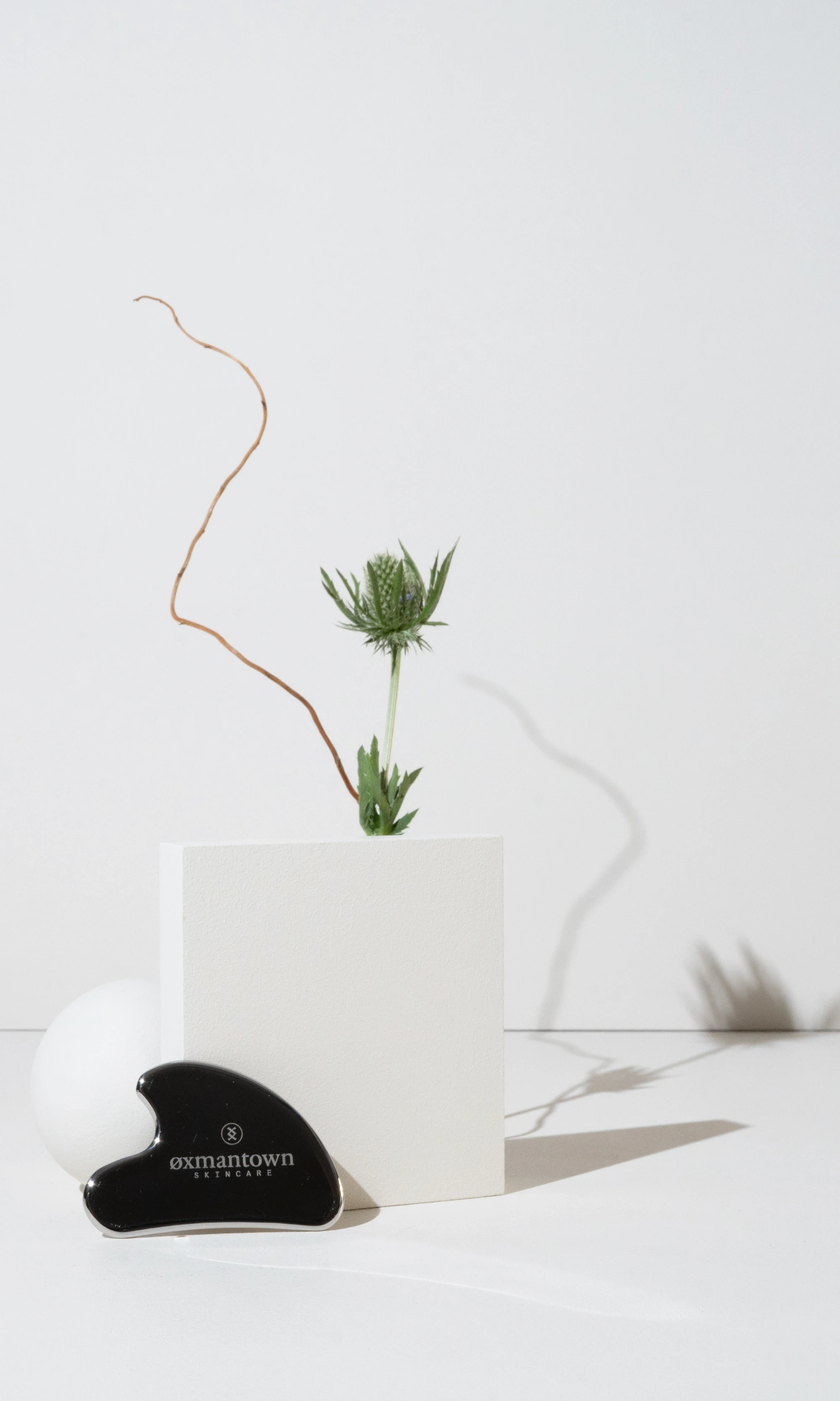
Product shot of the GUA SHA facial tool
Collection of small sample bottles with printed labels on them in a photoshoot setupw ith white backgrounds
a grid of products, various bottle and jar sizes, placed on a isometric grid, with some lying down on their side
product brochure on top of a box full of products in their boxes
mobile version of projects page, showing a catagory filter and a product grid with images and titles
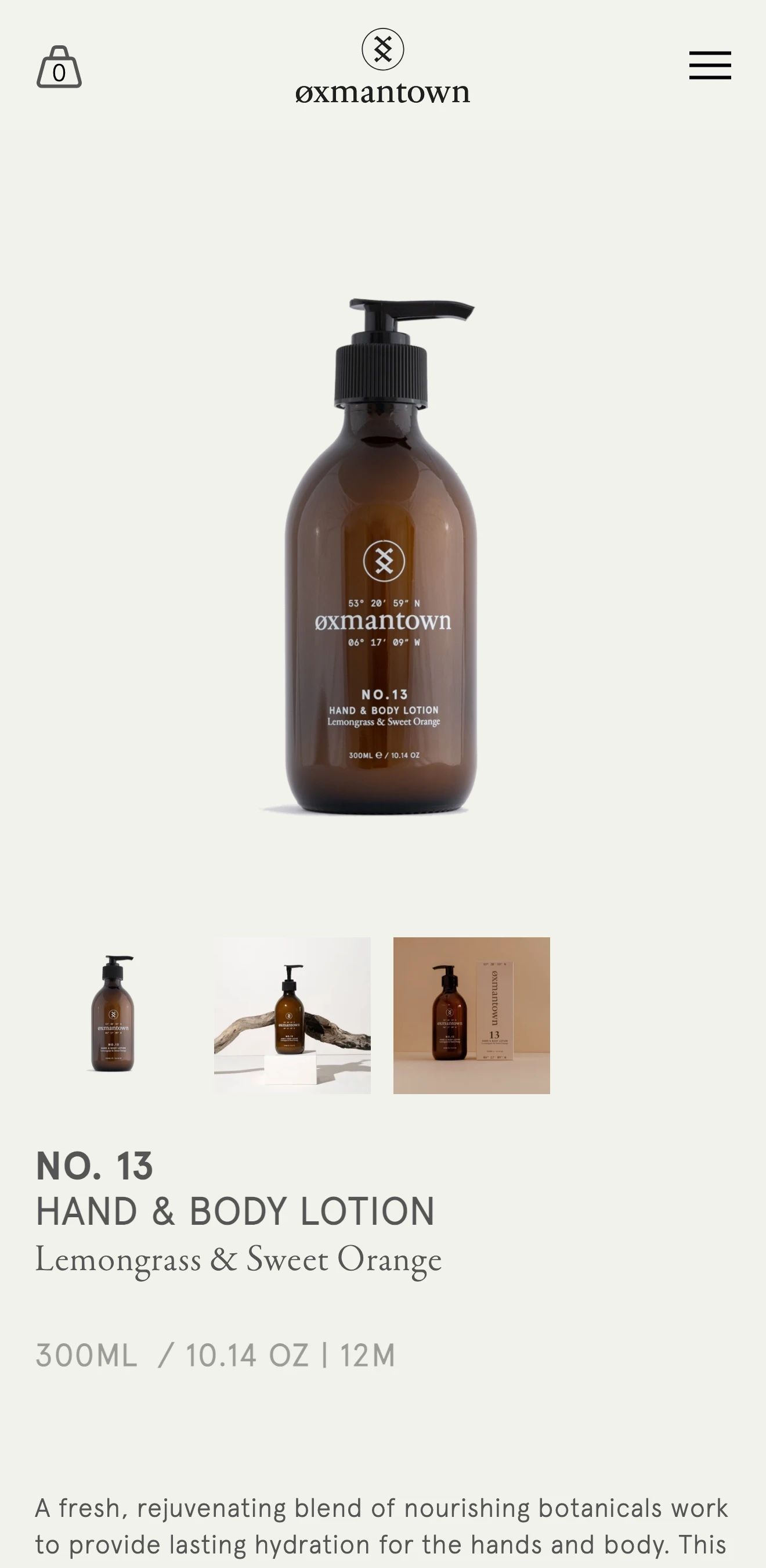
Mobile version of a product page on the website with the product image on top and the description below
Mobile version of the website showing a show by catagory section with images of the products and links to their respective sections

Decisions made

Two core objectives shaped the project, one being a drive to reduce waste and improving sustainability across the product line, while second being to create a more consistent aesthetic that could work across different bottle and box sizes.

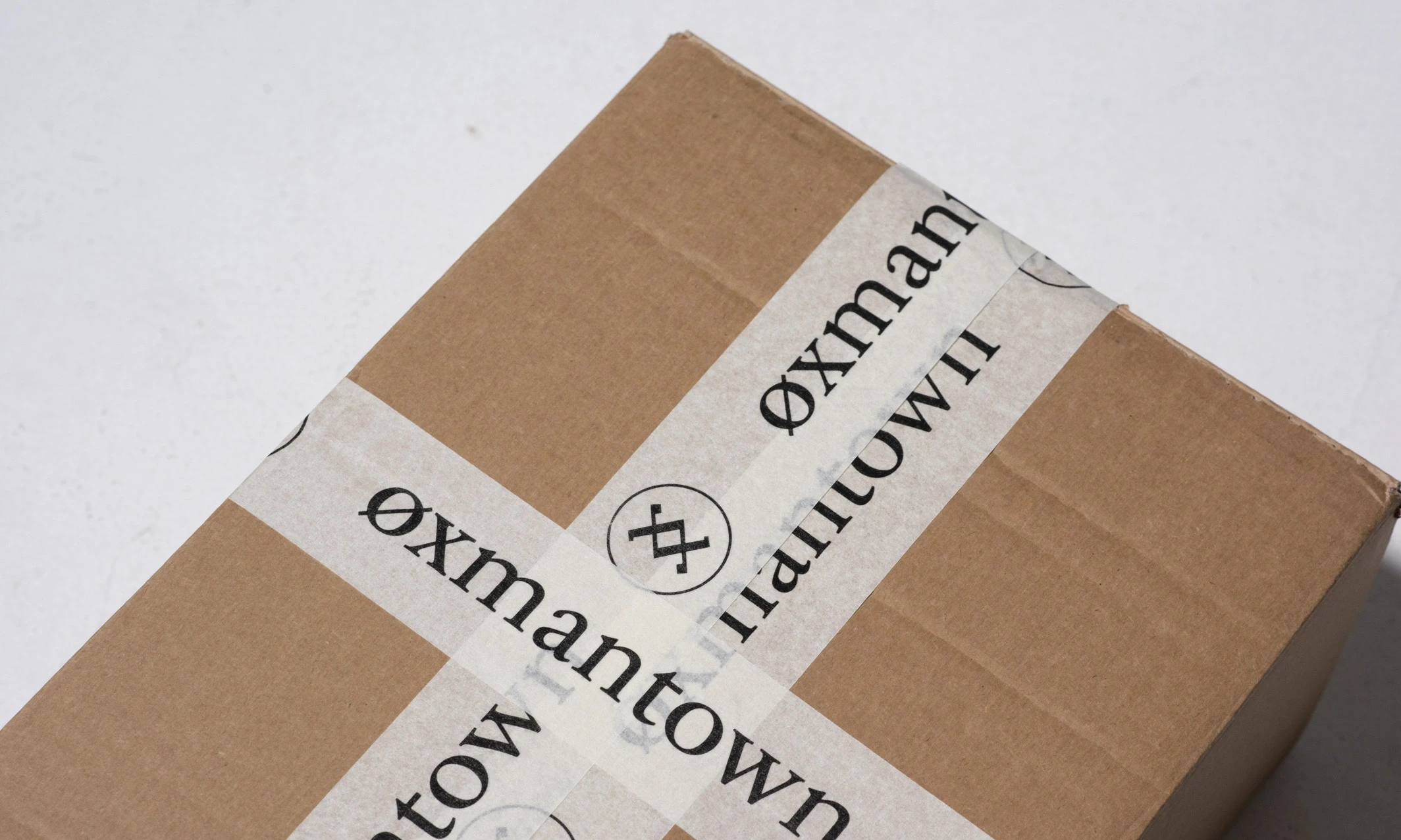
We sourced locally produced screen-printed bottles and FSCcertified biodegradable card packaging, reducing material use and the brand's overall environmental impact.

detail from website showing a product page grid with images of the products and their names
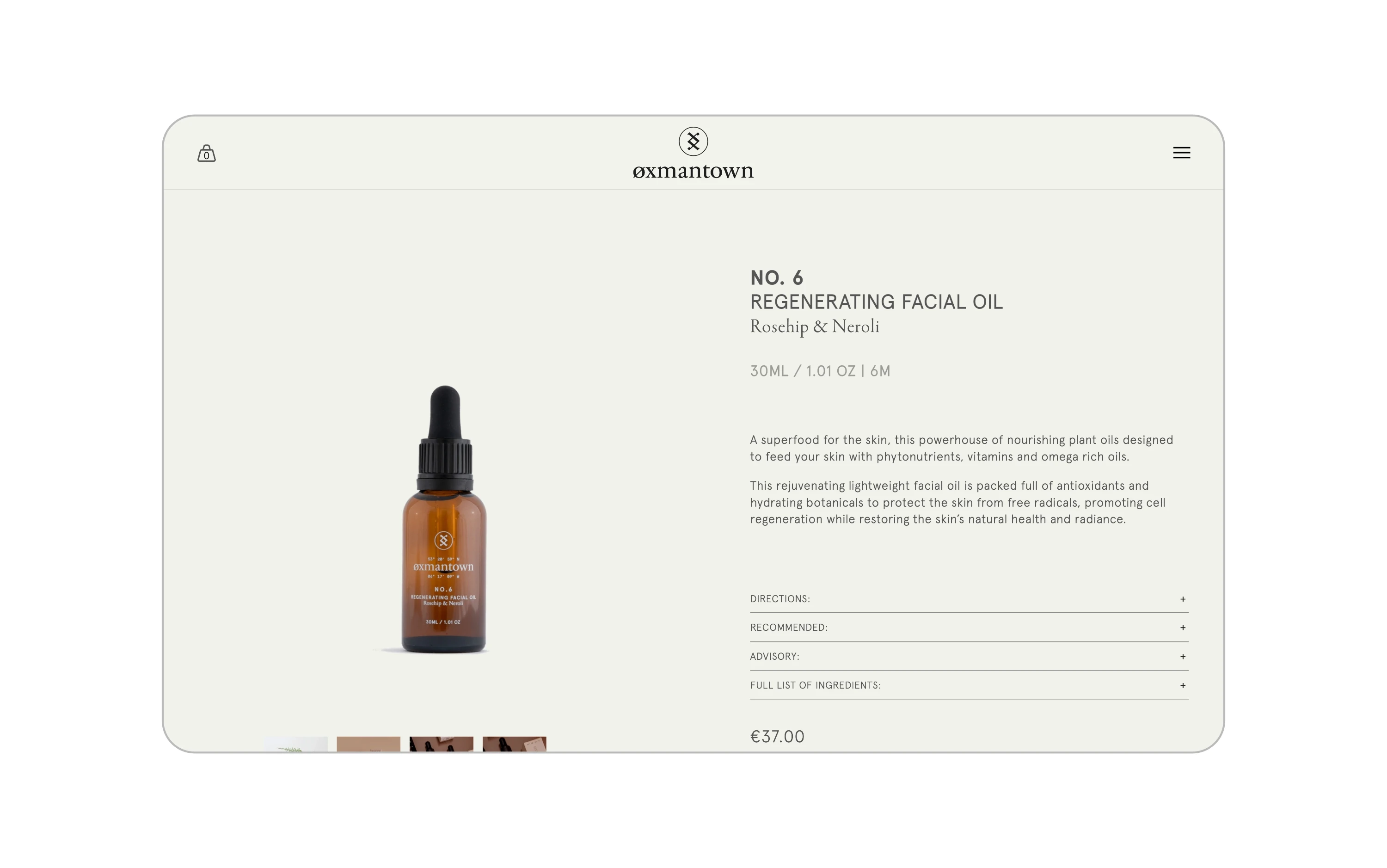
detail from website showing a product page with an image gallery on the right and a product description on the left
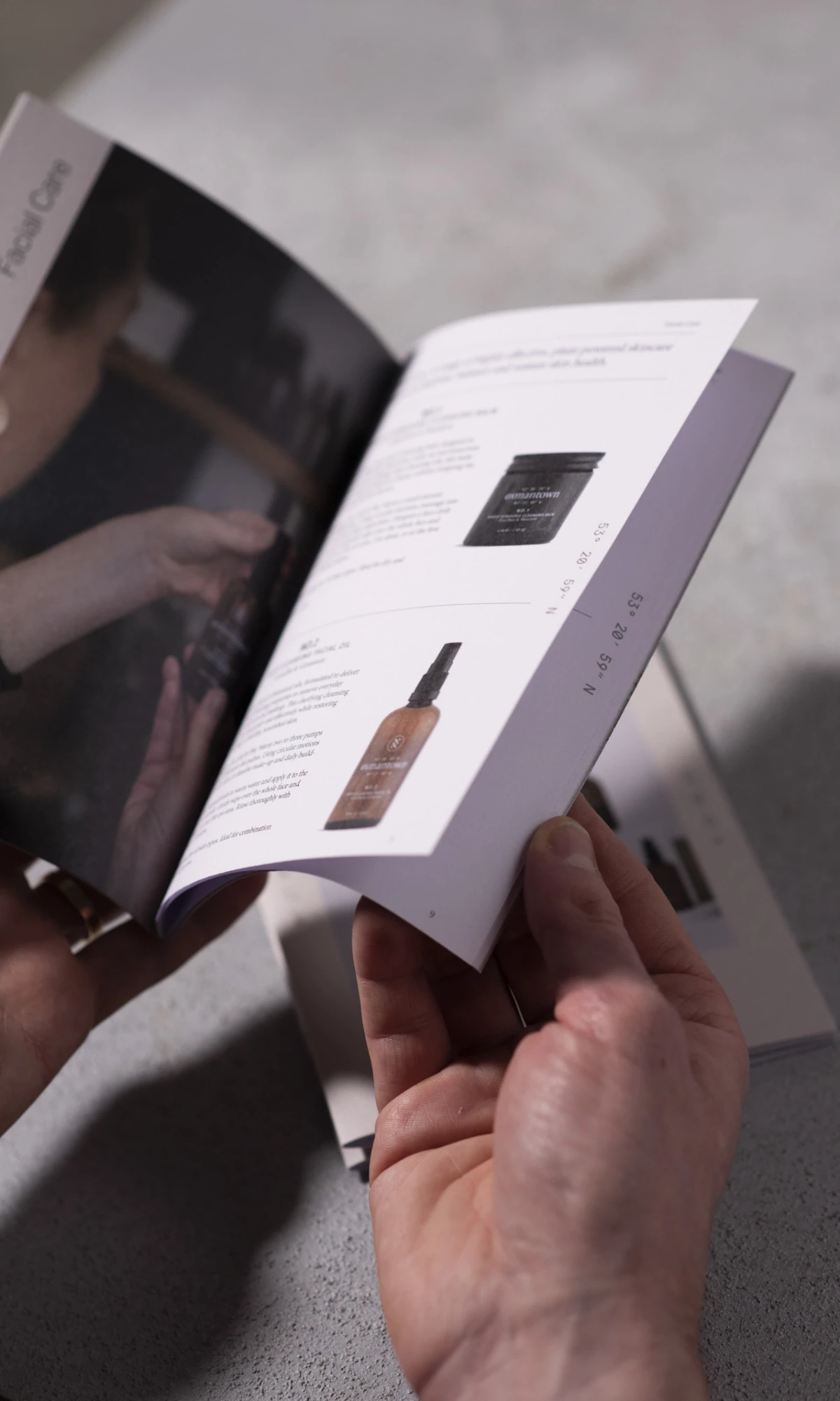
someone looking through a brochure with product desciptions and images of them on one page, and a detailed close up photo of the handcraft production process
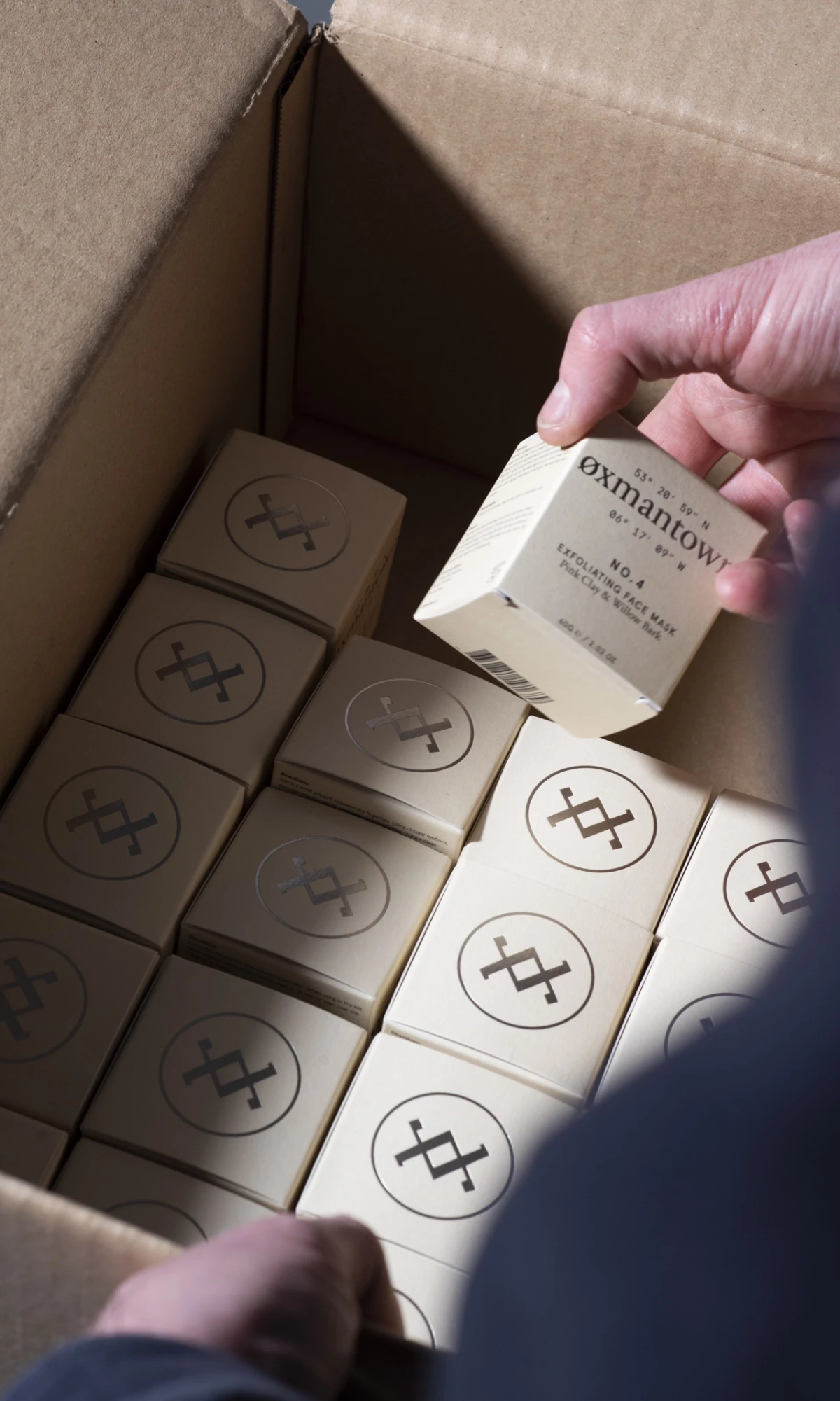
Hand placing boxes of cosmetics into a large cardboard box featuring oxmantown skincare branding

Outcomes

I developed a restrained typographic system with standardised type sizes, proportions and packaging layouts, creating a flexible framework that could be applied across the growing product range. The result was a more refined and cohesive identity that retained Oxmantown's original handcrafted character while giving the brand a clearer and more sustainable direction.
someone looking through a brochure with the text describing the history of the brand
Two 5 liter fluid containers with nozzle pumps on top with branded labeling on the side

Additional Contributors

Photography: Johnny Mallin
Photography: Ruth Connelly
Set and Styling: Play Nice Studio